Brand Identity
A brand is more than a logo.
It’s the feeling people get when they stumble across your name, scroll your feed, or see your work out in the world. We help you shape that feeling into something real, recognizable, and uniquely yours. From logos to full brand worlds, we build identities that look good, feel right, and grow with you.

Whether you’re starting from scratch or giving your brand a well-deserved glow-up, our branding services are designed to help you build something clear, consistent, and memorable. From foundational brand guides to full logo design and cohesive visual identity systems, we help create a look and feel that connects with your audience and shows up strong everywhere your brand lives.
No two businesses are the same, so we don’t offer one-size-fits-all packages. Instead of pre-set bundles and pricing, we scope each branding project around what actually makes sense for you, your goals, and where you’re headed next.
What We Build
-
Complete brand guides that define your visual style, voice, tone, and usage, so your brand stays consistent everywhere it shows up.
Have a logo but no guide? We can help build the framework.
Time Frame: 5-10 weeks
Investment: $1,800 - $3,500
-
Original logo concepts that reflect your story, personality, and audience.
$800- $2,000
-
From full rebrands to subtle updates, we help your brand grow and evolve, without losing what makes it yours.
Time Frame: 5-12 weeks
Investment: $900 - $2,500
-
Moodboards and tone explorations that define the feeling your brand evokes before any visuals are created.
Time frame: 1 - 2 weeks
Investment: Starting at $500
-
A full review of your brand’s strategy, visuals, and messaging to identify what’s working and what needs improvement.
Time Frame: 4-8 weeks
Investment: $1,200-$2,200
-
A competitive analysis that evaluates how your brand compares to others in your space and identifies clear opportunities to stand out.
Time Frame: 1-2 weeks
Investment: Starting at $750
Our tried + True Process
*
Our tried + True Process *
01 Discovery
This is where everything starts. We take time to understand your business, your audience, your goals, and the challenges you’re navigating right now. Through a discovery call and guided questions, we get clear on what’s working, what’s not, and where you want to go
What this looks like: a collaborative conversation, shared context, and alignment before any decisions are made.
02 Direction
Using what we uncover in discovery, we define the direction for your brand. This includes clarifying your positioning, voice, visual tone, and overall approach. This step ensures we’re not designing based on trends or assumptions, but on intention and strategy.
What this looks like: a clear creative roadmap that guides the rest of the project.
03 Creation
With direction set, we design the core elements of your brand — logo, color palette, typography, and supporting visuals. Every choice is tied back to the strategy, so your brand feels purposeful and consistent.
What this looks like: concepts, design drafts, and tangible brand assets taking shape.
04 Refinement
Good work gets better through editing. In this stage, we review, refine, and adjust based on feedback. We focus on clarity, usability, and the small details that make the final result feel polished and complete.
What this looks like: intentional revisions, thoughtful collaboration, and fine-tuning.
05 Launch
Once everything is finalized, we package and deliver your brand so it’s ready to be used in the real world. Whether that’s a website, social content, or visual assets, you’ll have tools that are easy to apply and built to last.
What this looks like: organized files, clear guidance, and a brand ready to grow with you..
Behind the Brand
Isle Events
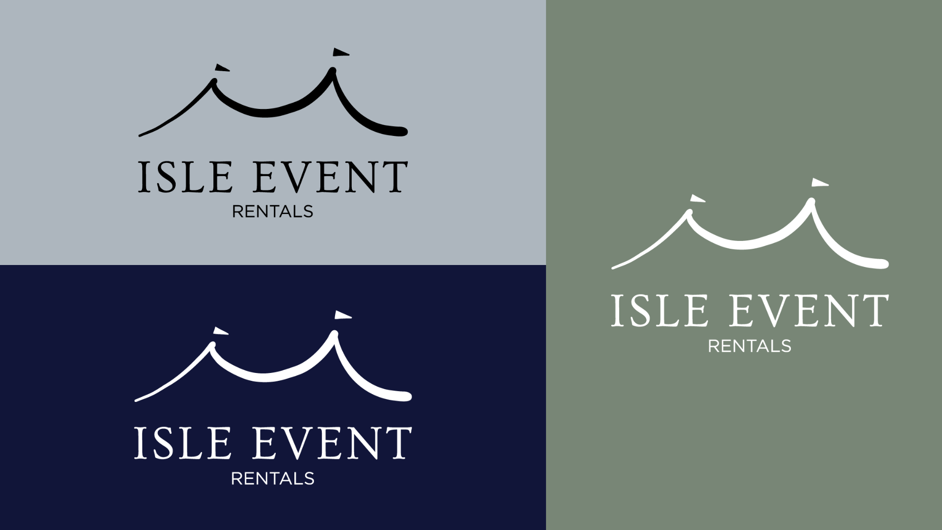
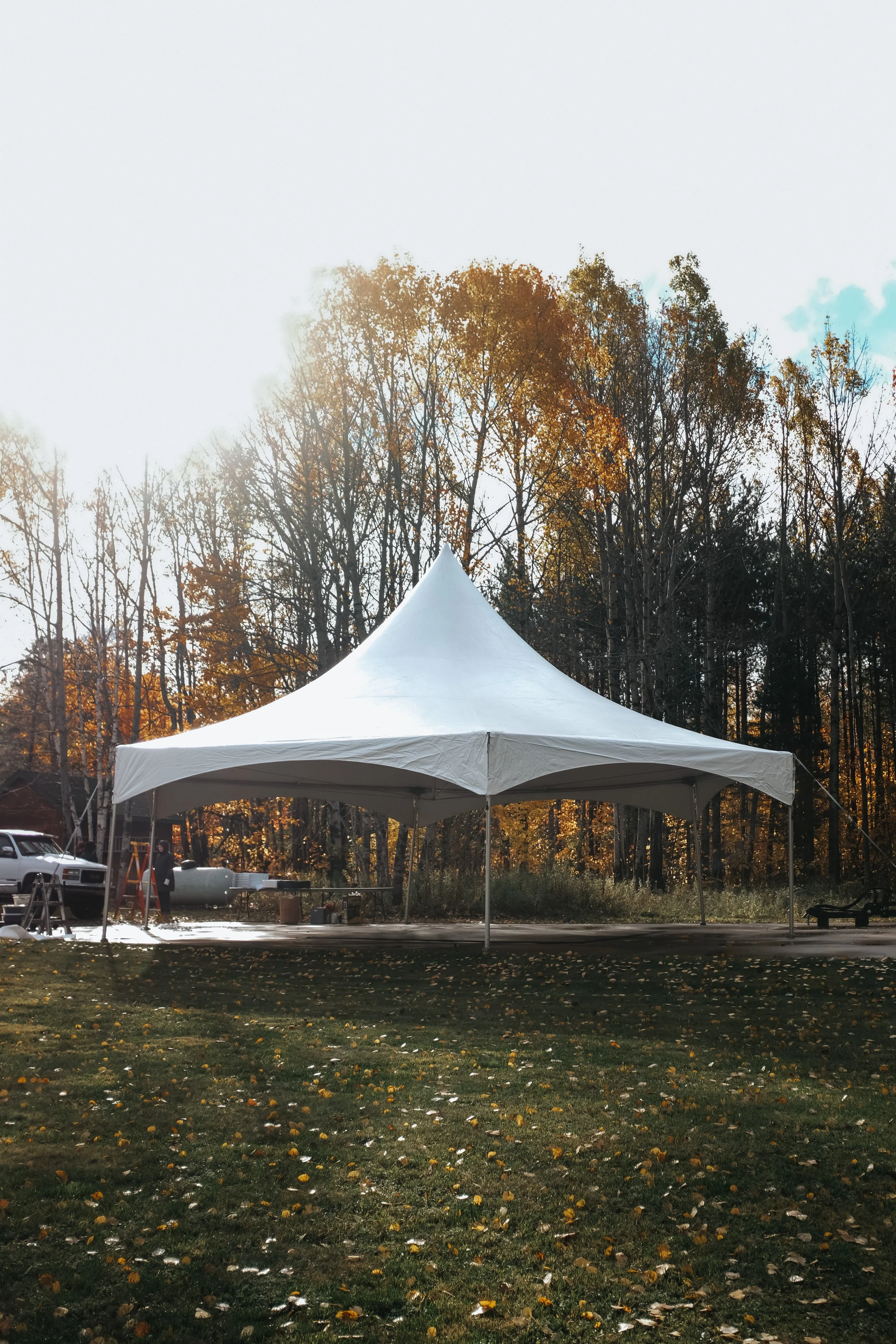
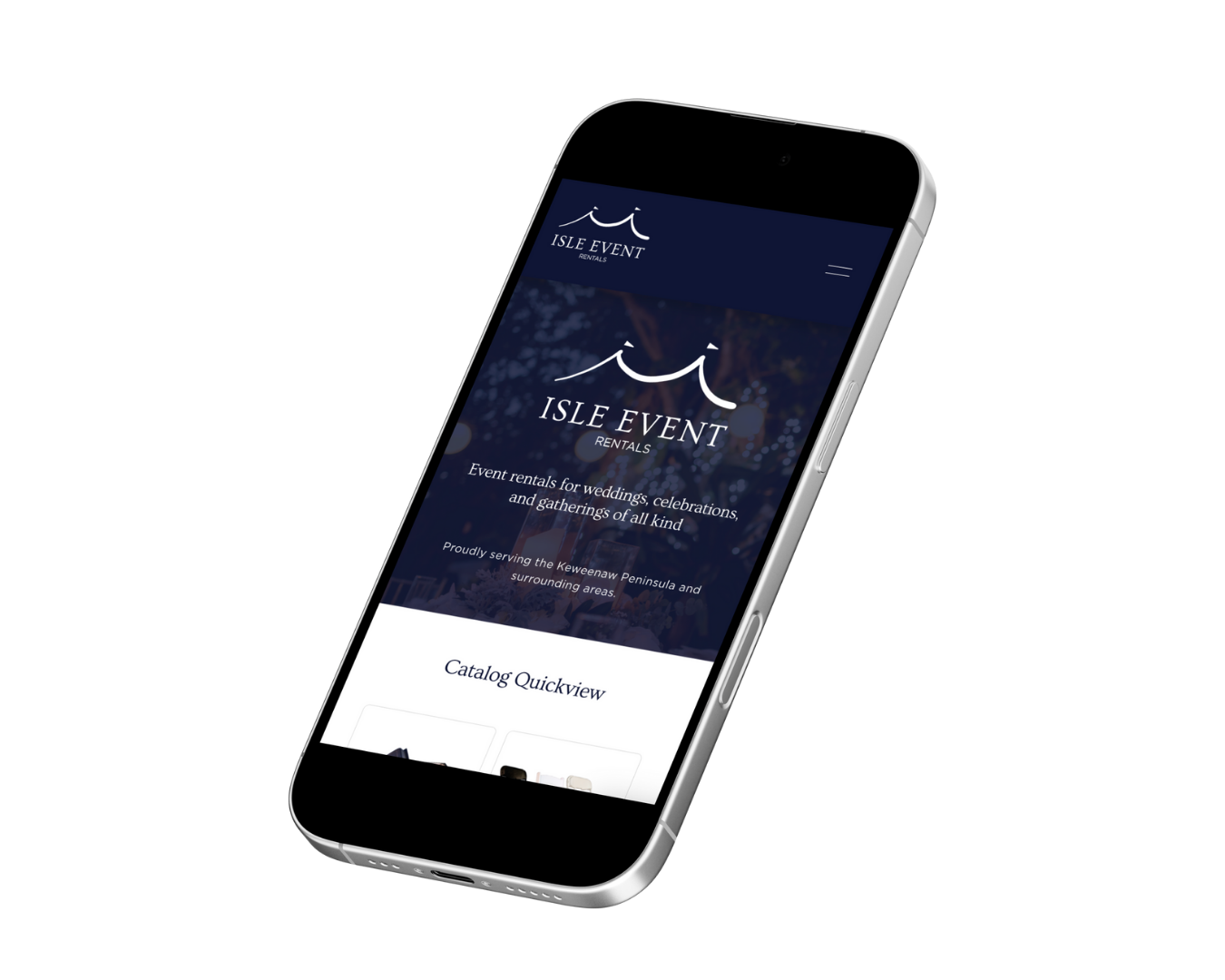
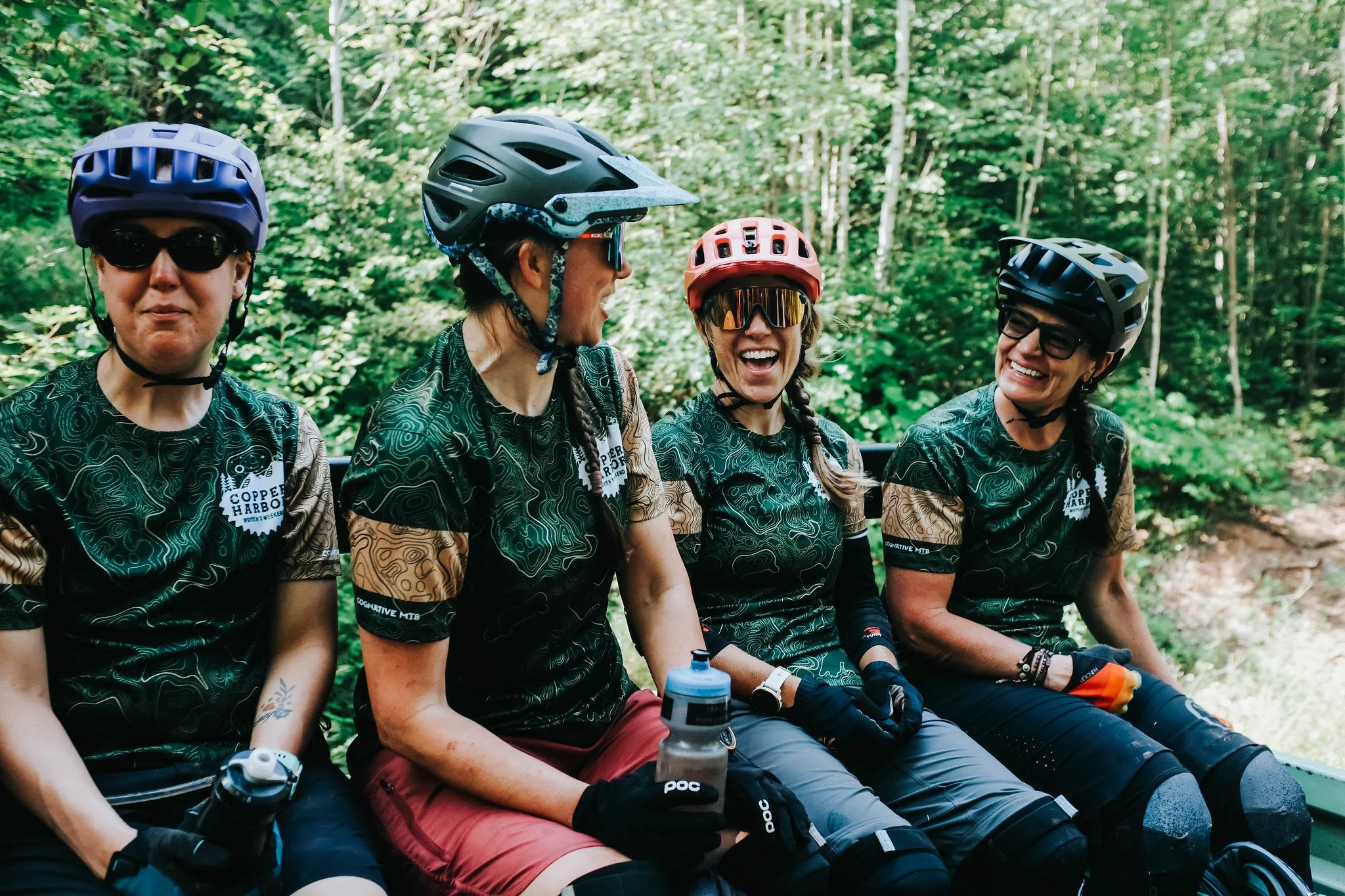
Every event tells a story, and Isle Event Rentals provides the pieces that make those stories unforgettable. Their brand, however, needed to reflect the elegance, warmth, and versatility of their offerings. We partnered with Isle to craft a cohesive brand identity that brings the business to life, even before a single event begins.
We started with the fundamentals: a new name, logo, and brand guide that captured Isle’s approachable sophistication. Every element was carefully designed to convey versatility, refinement, and a welcoming personality.
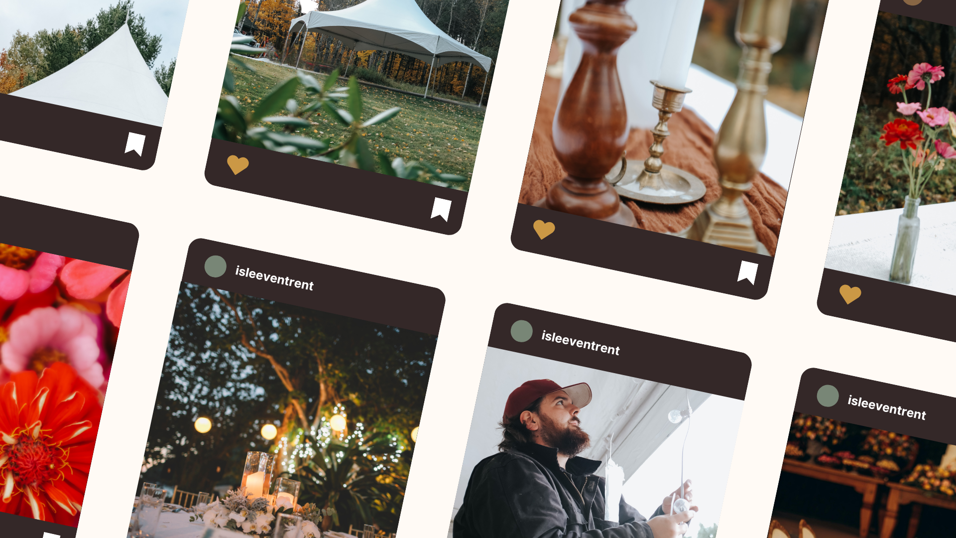
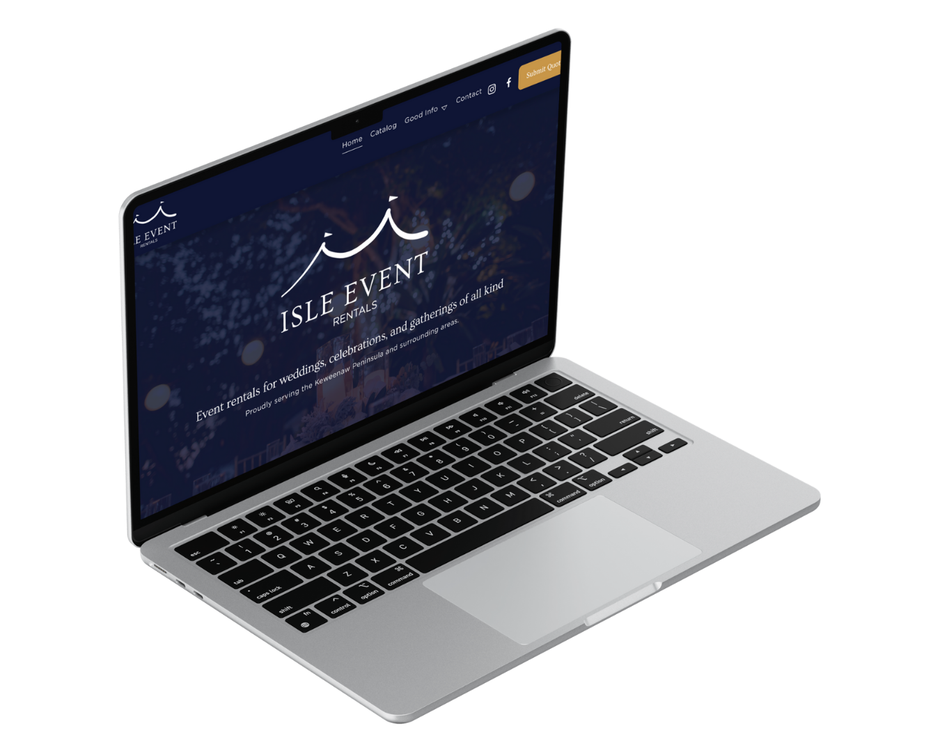
Next, we translated that vision into imagery and digital experience. Lifestyle and product photography highlighted the thoughtful details, textures, and versatility of Isle’s rentals, creating visuals that feel as warm and inviting as the events they help bring to life. Those assets seamlessly informed a modern, intuitive website that not only showcases their full range of offerings but also guides visitors naturally toward booking and inquiries.
The result? A cohesive brand that feels polished, intentional, and full of life, one that tells the story of Isle Event at every touchpoint. From visual identity to digital presence, this project demonstrates how strategic design, storytelling, and photography come together to elevate a brand and make it unforgettable.
Behind the Brand
Michelle Seguin md
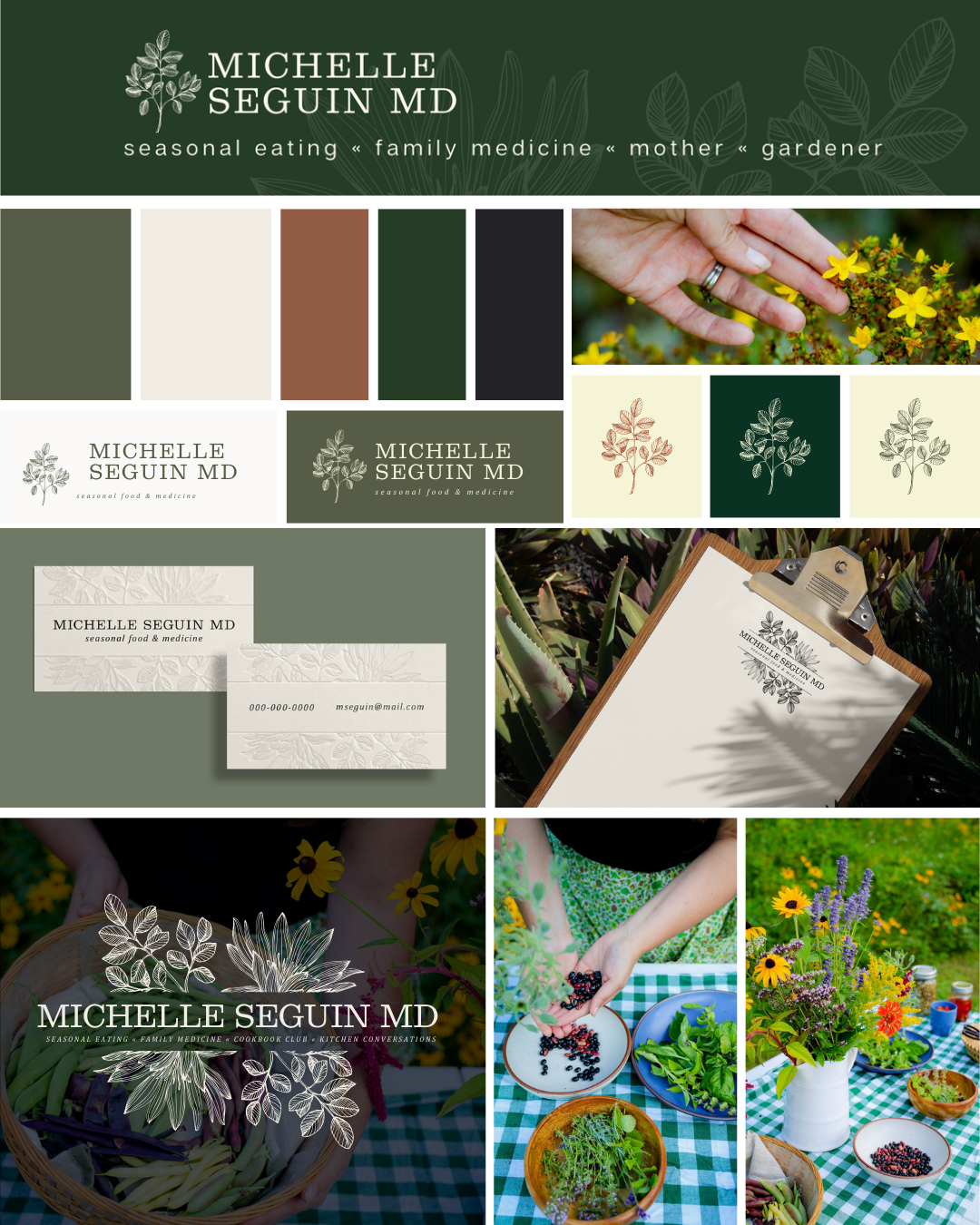
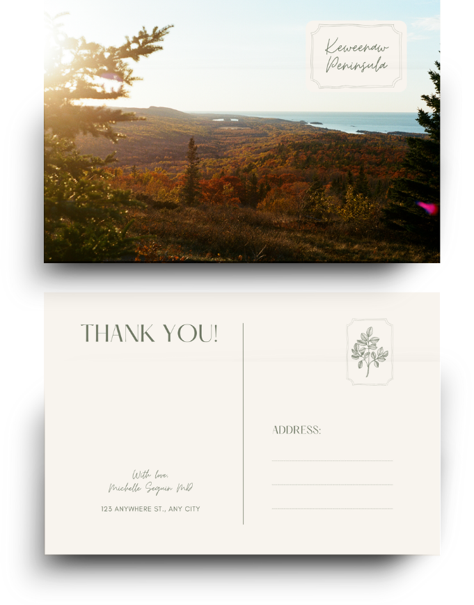
Michelle Seguin is a one-of-a-kind: physician, gardener, functional medicine practitioner, and literary storyteller. Her work blends science, seasonal living, food, and place in a way that is both authoritative and deeply human. Goose Collective partnered with Michelle to create a brand identity that reflects the full richness of her voice.
We started with the fundamentals: a visual language, typography, color palette, and templates that capture Michelle’s warmth, intellect, and connection to the Upper Peninsula. Every element was carefully designed to convey approachability, science with soul, and seasonal living as a framework for storytelling.
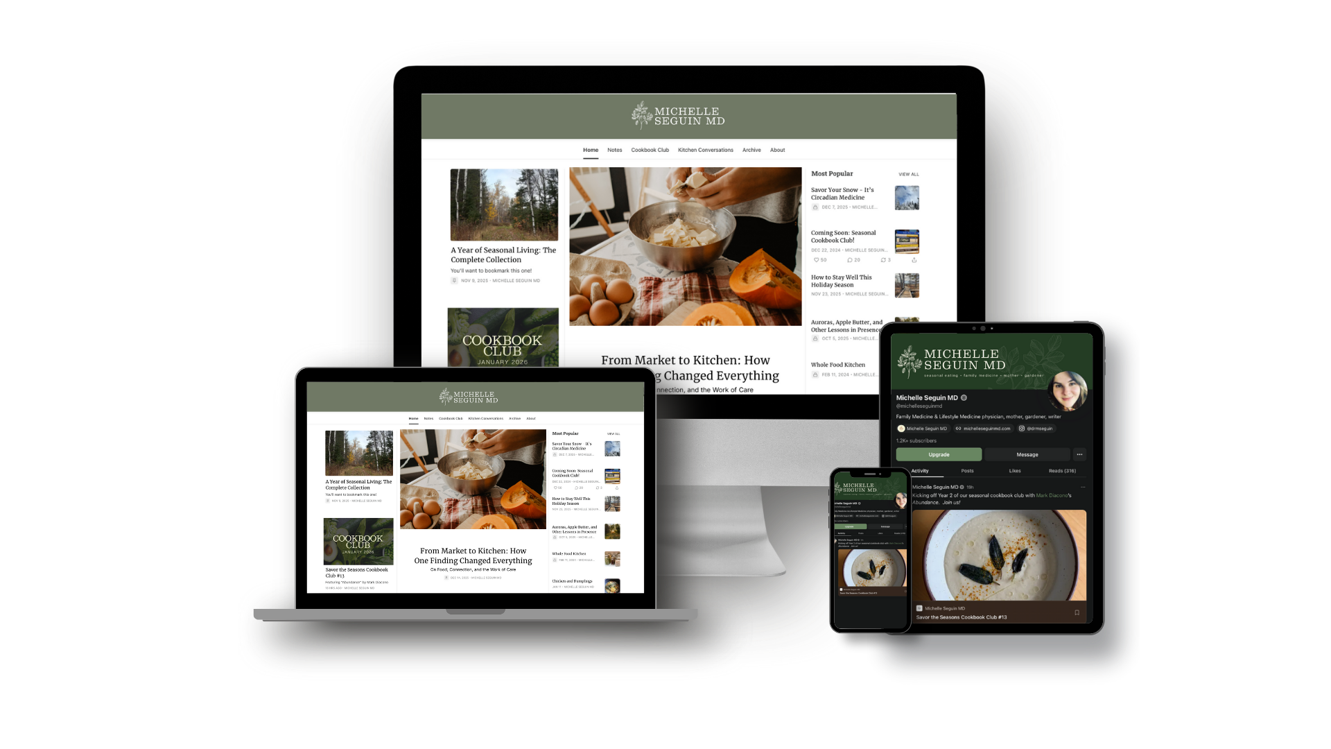
Next, we translated that identity across her platforms—online and beyond—including her Substack, guides, and future projects. Photography, layouts, and design elements highlight her garden, kitchen, and the landscapes that inspire her, creating a consistent, inviting, and immersive experience. Every touchpoint now communicates her philosophy and engages her community with clarity and intention.
From visual identity to digital presence, this project demonstrates how Goose Collective helps creators bring their message to life, strategically, beautifully, and authentically.
Behind the Brand
SMALL CRAFT
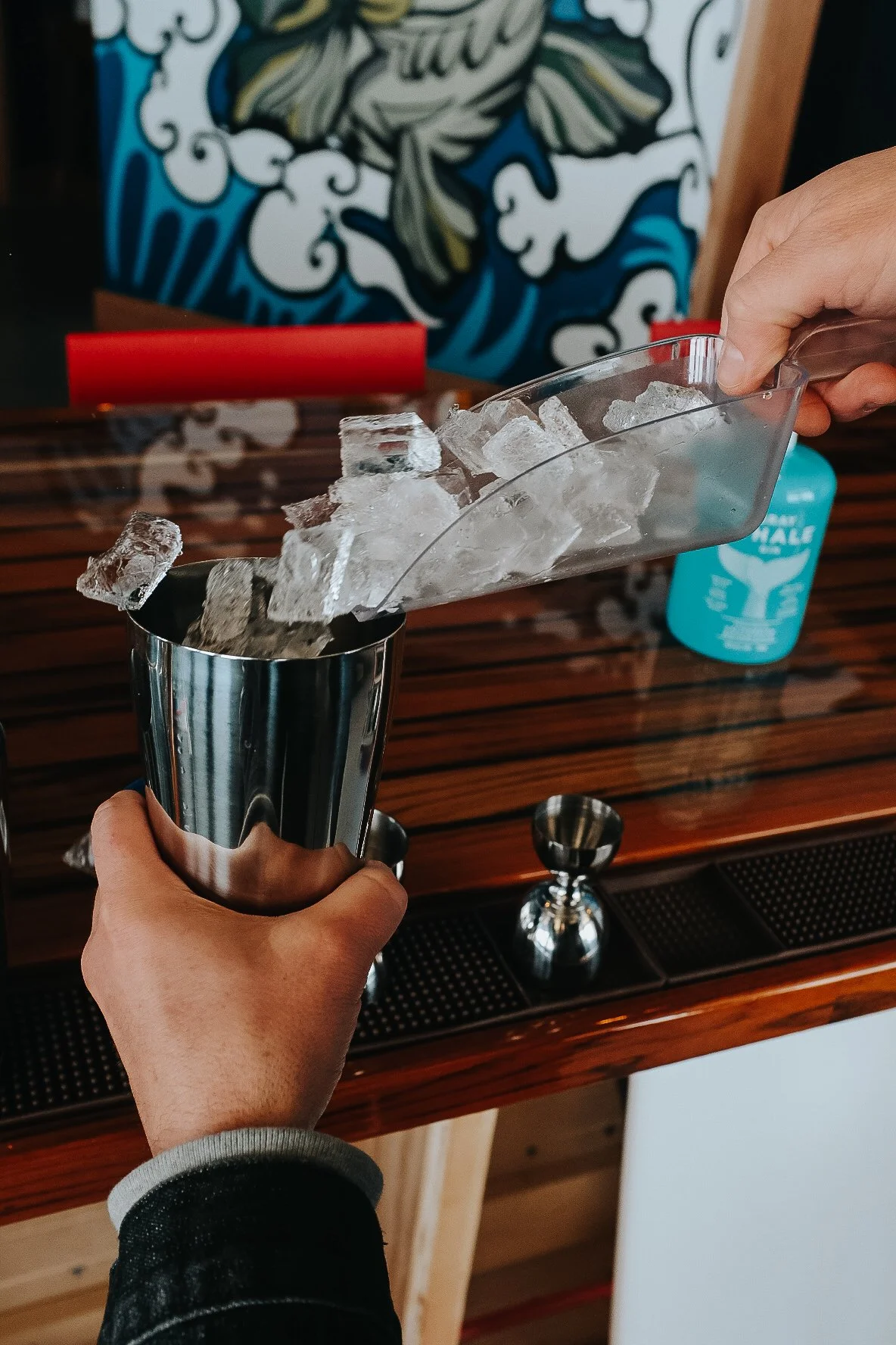

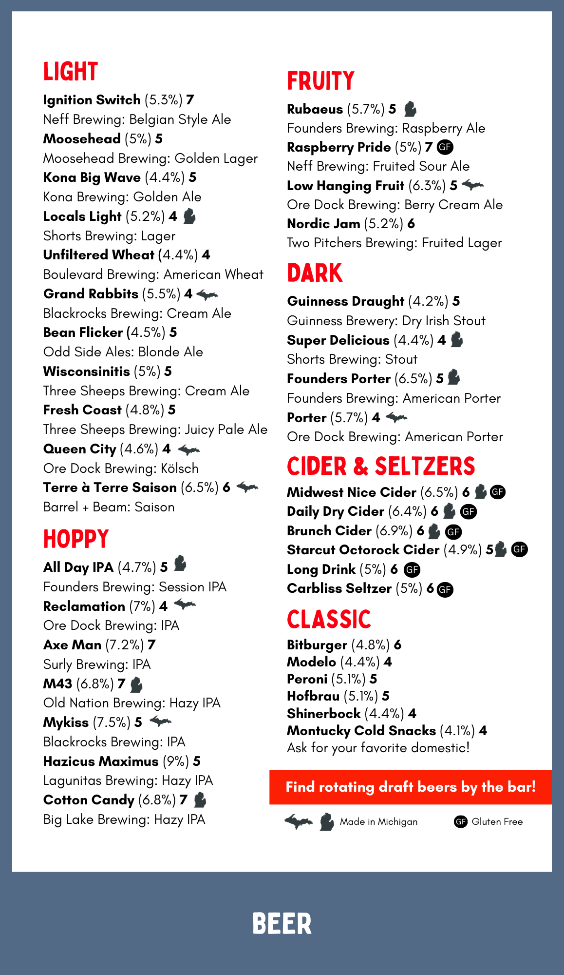
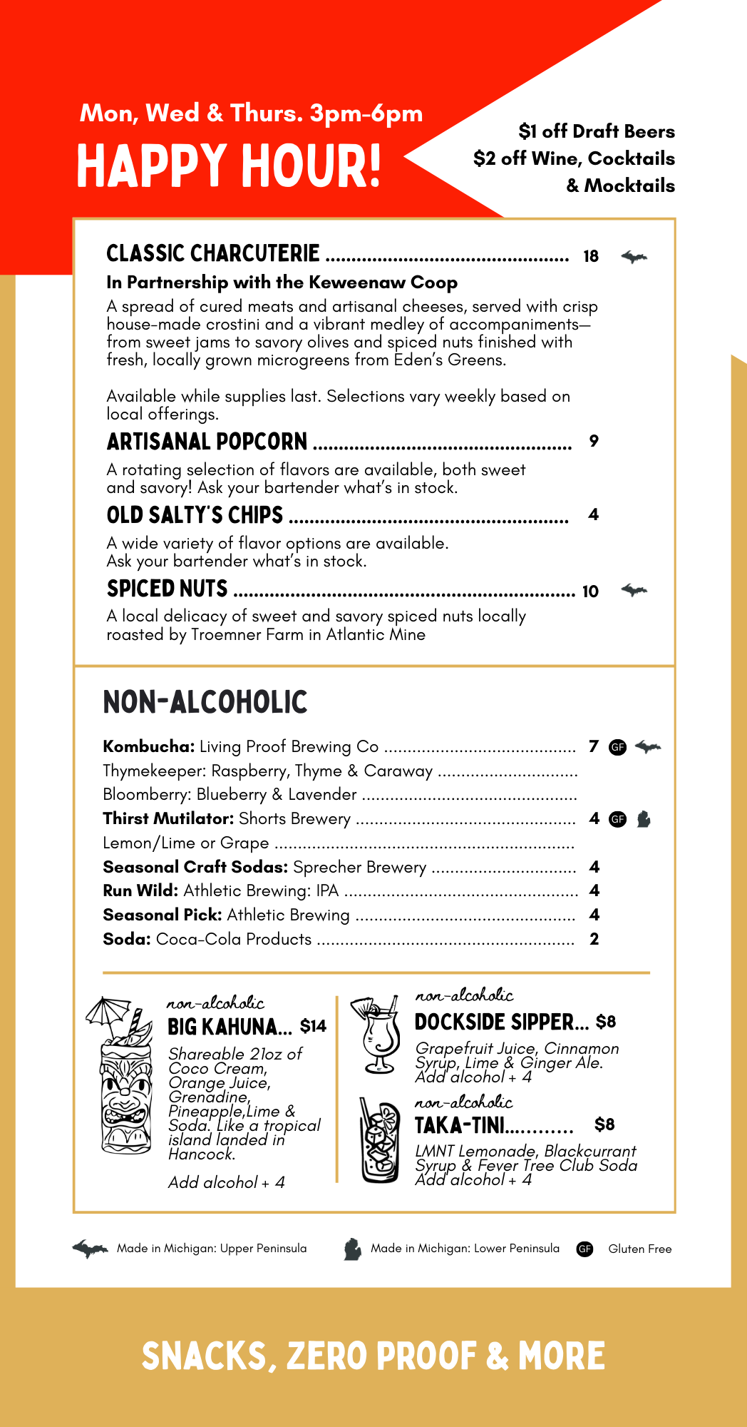
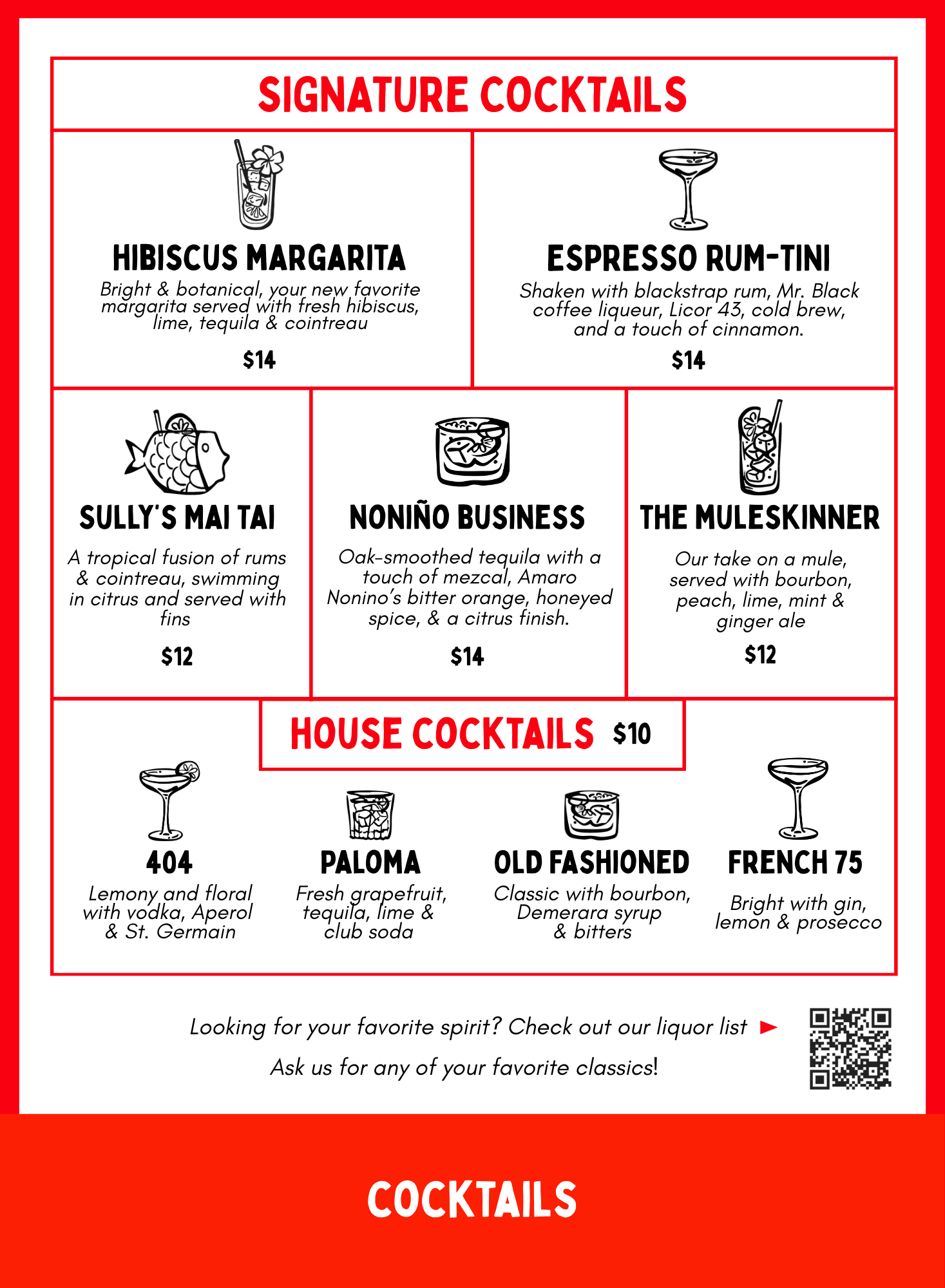
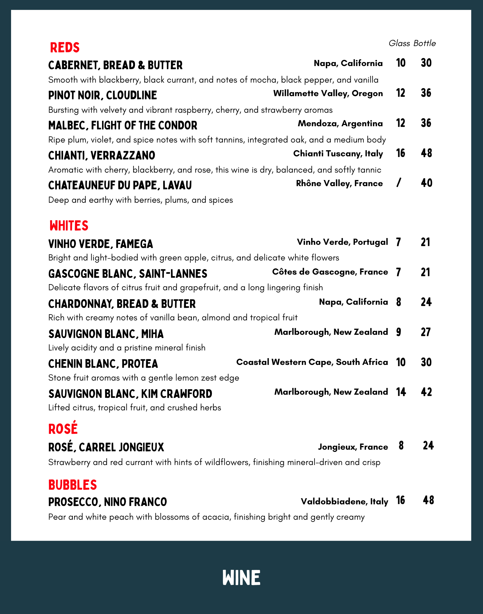
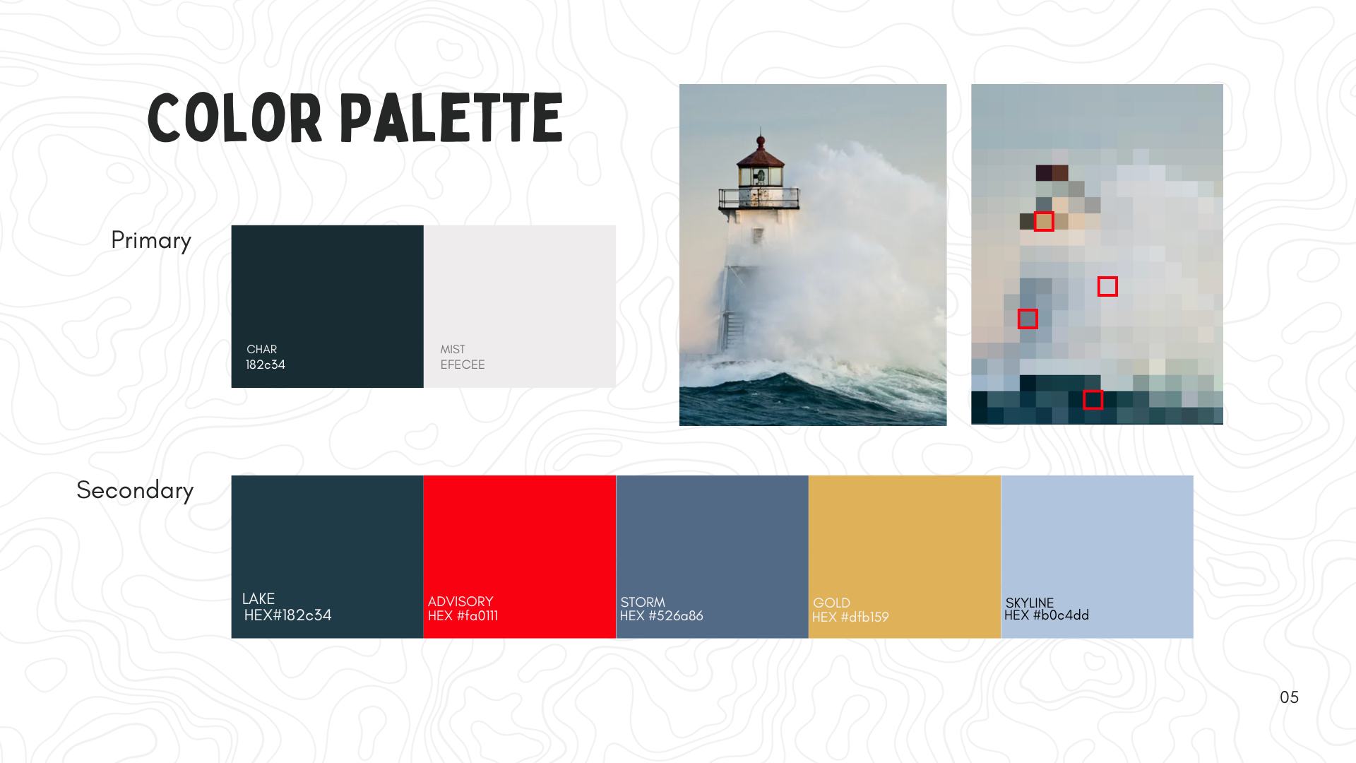
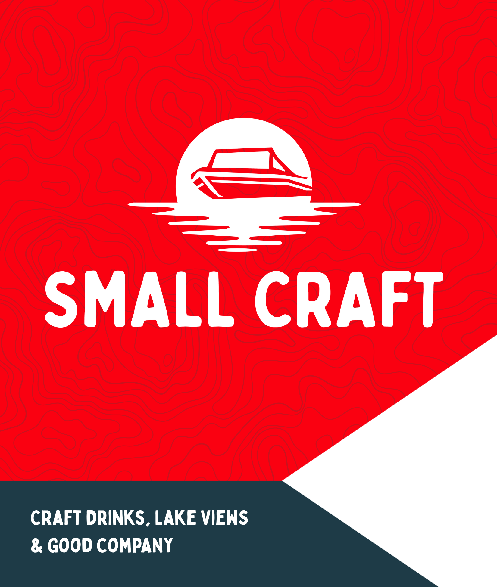

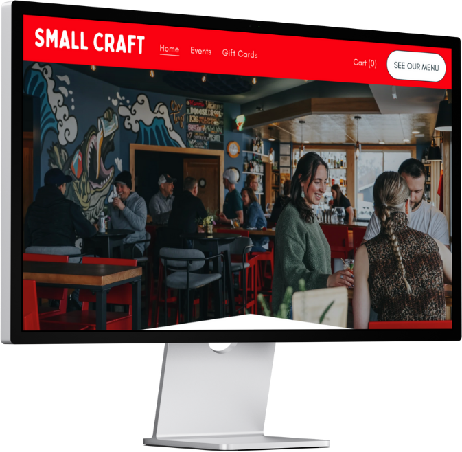
Small Craft came to us with a clear vision. Our role was to help shape it into a brand that feels true, usable, and unmistakably theirs.
We started by digging into their story, values, and the feeling they wanted people to have when interacting with the brand. From there, we explored mood and sentiment through layered mood boards that captured their artisanal, local spirit.
With that foundation set, we built out the visual identity. Logos, color palettes, typography, and thoughtful details, then carried it through their website, menu, and photography. The result is a cohesive brand system that shows up confidently everywhere.
Small Craft now has a brand that doesn’t just look good, it works, telling their story and growing right alongside them.